
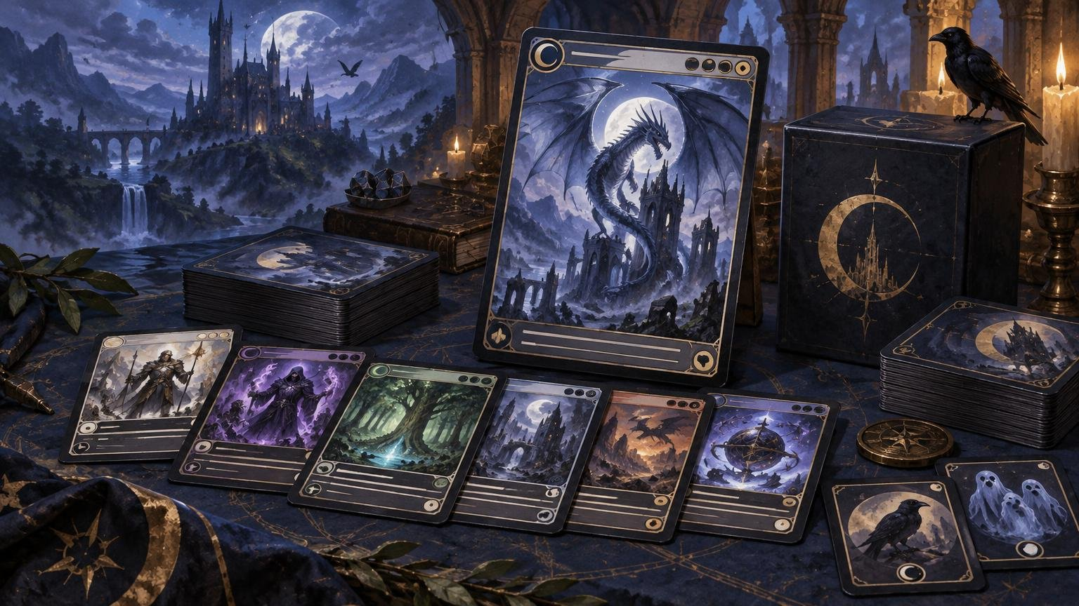
TLDR: Build a custom commander art matching deck by treating the commander as the visual north star, not as a subject that must appear on every card. Extract three to five motifs from the commander, assign different visual jobs to card categories, and preserve clear names, mana costs, type lines, rules text, and battlefield identities. Lock the legal decklist before assigning final art, then audit tokens, double-faced cards, and other extras separately.
The strongest custom Commander decks look like they belong to one world. They do not look like someone applied the same blue filter to 100 unrelated images and declared victory. Your commander should establish the deck’s world, mood, and visual vocabulary; the other 99 should explore that direction with enough variation to keep individual cards recognizable.
That balance is the entire project: unity without sameness. A cohesive deck repeats selected colors, environments, symbols, textures, and framing choices. A playable deck also lets everyone identify a Sol Ring, basic land, removal spell, or commander without conducting an art-history seminar in the middle of combat.
Write a visual brief for your commander
Start with a one-paragraph brief before choosing art for individual cards. Describe who or what the commander is, where the deck appears to exist, how its mechanics feel, and what emotional tone should carry through the deck.
A graveyard commander might suggest candlelit crypts, eroded stone, pale spirits, root-filled ruins, and a palette built around charcoal, bone, and muted green. A spellslinger commander could support observatories, glowing diagrams, storm-lit towers, ink, glass, and sharp flashes of saturated color. Neither direction requires putting the commander’s face on Cultivate.
- Character or creature identity: ruler, monster, scholar, machine, wanderer, cult leader, or reluctant hero.
- Setting: city, forest, battlefield, laboratory, ocean, wasteland, dreamscape, or celestial realm.
- Mechanical identity: sacrifice, counters, artifacts, tokens, combat, recursion, theft, or spell chaining.
- Emotional tone: triumphant, eerie, playful, solemn, chaotic, romantic, or brutal.
- Visual language: recurring palette, materials, symbols, lighting, borders, and typography.
Reduce this material to a single direction sentence. For example: “An aristocrats deck set in a decaying moonlit court, using silver masks, black roses, candlelight, and faded ceremonial fabric.” That sentence is specific enough to guide the 99 but broad enough to support creatures, lands, removal, and artifacts.
Choose a limited motif library for the matching 99
Use three to five recurring motifs. Fewer can make the concept feel thin; too many can turn the deck into a fantasy junk drawer. Motifs can be objects, environments, lighting treatments, shapes, materials, or small narrative details.
For the decaying-court example, the motif library might contain silver masks, black roses, tall windows, candle clusters, and torn banners. Every card does not need all five. Repeating one or two at a time is enough to imply a shared place.
Palette should support the motif library rather than imprison it. Choose a dominant family, a secondary family, and one accent color. Allow individual cards to depart from that palette when recognition or dramatic emphasis requires it. A board wipe should be allowed to look catastrophic. A seven-mana finisher has earned more visual volume than a two-mana rock.
Give every card role a visual job
Visual hierarchy keeps a themed deck from becoming monotonous. The commander is the focal point, but different packages should express different parts of the same world.
| Card role | Visual job | Useful direction |
|---|---|---|
| Commander | Primary focal artwork | Strongest silhouette, clearest face or symbol, highest contrast |
| Engine pieces | Supporting cast | Characters, workshops, rituals, or locations that explain how the deck operates |
| Ramp and fixing | Resources and infrastructure | Roads, maps, mines, gardens, relics, or sources of magical energy |
| Interaction | Conflict and disruption | Duels, traps, shattered objects, storms, imprisonment, or hostile forces |
| Finishers | Major set pieces | Large-scale creatures, disasters, coronations, invasions, or transformations |
| Lands | Environmental continuity | Wide views of the setting with unmistakable land-type cues |
| Tokens and emblems | Repeated game objects | Simpler compositions with clear creature type, stats, and state |
This role-based approach also helps awkward staples fit an unusual theme. Instead of asking how a generic staple resembles your commander, ask what function it serves in the commander’s world. A mana rock becomes a royal seal, reactor core, sacred lantern, or navigation device. A counterspell becomes a broken incantation or sealed doorway. The mechanical role gives the art a reason to exist.
For more theme directions suited to full-deck treatment, see Commander deck themes for cohesive proxy builds.
Build consistency without visual sameness
Cohesion comes from shared worldbuilding more reliably than repeated subject matter. If every creature features the commander in the same pose, cards blur together and the commander becomes less special. Let the 99 reveal the commander’s allies, enemies, architecture, resources, wildlife, history, and consequences.
Frames and typography can provide another layer of consistency, but use restraint. Keep the basic information architecture stable even when illustrations vary. Consistent title placement, mana-symbol treatment, type-line styling, and text-box contrast do more for unity than forcing identical compositions.
Deliberate exceptions are valuable. Reserve a border treatment, crest, foil-like accent, or especially dramatic composition for the commander. Give signature engine pieces a related but quieter treatment. Use a separate, immediately recognizable system for basics and tokens. Hierarchy makes the deck feel designed rather than duplicated.
Keep custom Commander art readable in a real game
A card must still function as a game piece when the table is crowded, the lighting is mediocre, and someone has created twelve tokens with three different sets of counters. Commander Proxies’ order checklist recommends checking the card name, mana cost, type line, rules text, and relevant power, toughness, or loyalty, while also distinguishing the commander, basics, tokens, and double-faced cards.
- Use strong contrast between rules text and its background.
- Keep card names and mana costs in predictable locations.
- Do not let decorative borders crowd the type line or text box.
- Make power and toughness legible without lifting the card from the battlefield.
- Give the commander an obvious identifier that remains visible in the command zone.
- Keep basic land types recognizable through both text and environmental cues.
- Avoid using nearly identical art on cards that regularly appear together.
Recognition matters most for repeated battlefield objects. Five matching Saprolings can share art because they represent the same object. A Treasure, Food, Clue, and Blood token should not share an almost identical brown artifact illustration. Matching the deck is useful; making players read every token twice is not.
Extend the art plan beyond the 100 cards
Tokens, emblems, copy markers, transform helpers, dungeons, and other play aids are separate from the Commander deck itself, but they can dominate the table visually. Inventory them after the main list is stable, then give each repeated object a simple, recognizable treatment.
Match tokens through palette, setting, and symbols while preserving clear names, creature types, stats, keywords, and tapped-state readability. Emblems should look distinct from permanents because they operate differently. For a deeper helper-piece workflow, use the guide to themed Commander tokens and emblems.
Double-faced cards need special attention. Decide whether both faces receive art, how the reverse face will be represented during play, and whether you need a substitute or reminder card. Whatever method you use, it should make the current game state obvious without repeatedly removing cards from sleeves.
Lock the decklist before assigning final art
Do not finish 100 art assignments while the deck is still changing by ten cards after every goldfish session. Wizards describes Commander as a 100-card format centered on a commander, normally using singleton construction other than basic lands and restricting cards according to the commander’s color identity. The official Commander format overview is the appropriate starting point for current construction guidance.
First finalize the functional list. Confirm card count, color identity, singleton compliance, mana base, curve, interaction, and win conditions. Then freeze a dated order copy and map art to that version. Keep speculative swaps in a separate flex list so a maybeboard does not quietly become part of the physical deck.
Partner commanders and other multi-card command-zone structures need a shared visual brief rather than one unquestioned focal point. Give the pair a common setting and motif library, then differentiate them through complementary colors, symbols, poses, or framing. They should read as a pair without becoming twins.
Before submitting anything, run the Commander proxy order checklist. Reconcile the final decklist with the art assignment sheet and any cart or project manifest. A missing basic is annoying; a missing combo piece disguised by three filenames called final-final-v4 is Commander’s least exciting alternate win condition.
Match the project to the intended table
A visually polished deck does not communicate its power level. Discuss fast mana, tutors, compact combos, heavy stax, or other expectation-setting elements separately from the artwork. Wizards presents Commander Brackets as optional tools for aligning expectations and emphasizes the value of the pregame conversation.
Proxy expectations also vary by playgroup, store, and organizer. Wizards states that sanctioned events require authentic Magic cards, apart from limited judge-issued replacements for cards damaged during that event. Check with the relevant organizer instead of assuming a casual table’s approach applies to a sanctioned event. The official Wizards proxy-policy explanation provides the policy context.
Turn the visual brief into a finished project
Your final project packet should contain the locked decklist, one-sentence art direction, motif library, palette, role map, card-by-card assignment sheet, and separate inventory of tokens and play aids. Add notes identifying the commander, basics, double-faced cards, and anything requiring unusual handling.
Confirm a provider’s current file, art, and project requirements before building the workflow around them. Commander Proxies invites custom requests with the project goal, theme, and consistency requirements, making a support-assisted conversation the sensible route for questions about a fully coordinated build. The broader custom Commander proxy deck ordering guide can help organize the decklist-to-project handoff.
If part of the project uses existing Magic printings rather than newly supplied artwork, print-on-demand MTG proxies may offer a simpler path for those cards. Keep that workflow separate from original-art requirements until the provider confirms what its current ordering interface supports.
Frequently asked questions
How many motifs should a Commander deck use?
Three to five is a practical range. Choose motifs broad enough to appear across creatures, spells, artifacts, and lands. Repeat them selectively rather than placing every motif on every card.
Should lands and tokens match the commander theme?
Yes, but they should retain their gameplay identities. Lands are excellent for showing the wider environment, while tokens can use simplified versions of the deck’s palette and symbols. Basic land types, token names, stats, and relevant abilities should remain obvious.
How do I make generic staples fit an unusual theme?
Translate the staple’s function into the deck’s world. Ramp becomes infrastructure or resources, removal becomes conflict, card draw becomes research or prophecy, and protection becomes armor, shelter, or intervention. Functional translation usually feels more natural than forcing the commander into every scene.
Do tokens and double-faced cards count toward the 100-card deck?
Tokens and ordinary play aids are not part of the deck’s 100 cards. Double-faced cards that are actual cards in the deck do count, even though they have two faces. Track helper pieces separately so they do not distort the deck count.
Make the commander the anchor, not the wallpaper
The best custom-art Commander deck gives its commander a world to inhabit. Define that world with a short brief, repeat a restrained group of motifs, and let each card package show a different part of the setting. Preserve visual contrast for the commander, basics, tokens, and critical game information.
Finalize the playable list before committing to the art map. Then audit every card and helper piece as both an illustration and a game object. If the deck feels unified from across the table and remains understandable once the board becomes complicated, the visual system is doing its job.