
This post helps Commander players who ordered proxies run a fast MTG proxy quality checklist, so you can sleeve up with confidence and catch real problems before game night.
TLDR
- Pass if the cards are easy to read at table distance, fit sleeves, and shuffle smoothly without feeling “marked.”
- Fail if you see blurred text, cuts into the frame/text, sticky/tacky surfaces, or one card that’s noticeably thicker/thinner than the rest.
- Normal: tiny centering drift, slight color variance, mild curl that disappears in a sleeve.
- Problem: misprints you can spot from across the table, or anything that makes a card identifiable in the deck.
You know the moment. Package arrives. You hold the top card up to a lamp like you’re grading a gemstone. Totally normal behavior. This MTG proxy quality checklist is the calmer way to do that, and it takes about two minutes.
MTG proxy quality checklist: the 2-minute pass/fail
Do these in order. If you hit a hard fail, stop and quarantine the deck before you shuffle it into a game.
1) The table-distance test (readability)
Hold a card at roughly arm’s length, like it’s on the battlefield and your friend is across the table.
- PASS: Card name, mana cost, type line, and the first lines of rules text are clean and readable.
- FAIL: Text looks fuzzy, smeared, or “double printed.” Mana symbols look like tiny potatoes.
2) The sleeve test (fit)
Sleeve one card, then slide it in and out a few times.
- PASS: The card fits normally, no forced corners, no “this feels like cardboard fighting back.”
- FAIL: It catches hard on the sleeve, bows the sleeve, or you need to force it.
3) The shuffle test (feel)
Shuffle a sleeved stack. Pay attention to drag and clumping.
- PASS: Normal shuffle feel, no sticky grabbing.
- FAIL: Cards cling together, feel tacky, or make you shuffle like you’re afraid of them.
4) The edge-and-corner test (damage risk)
Run a finger lightly along edges and corners.
- PASS: Smooth edges, rounded corners, nothing sharp.
- FAIL: Burrs, sharp corners, or rough edges that will chew sleeves.
5) The “marked card” test (consistency)
Pick 10 random cards and pinch the stack. You’re checking thickness and stiffness.
- PASS: They feel uniform.
- FAIL: One feels noticeably thicker, thinner, stiffer, or glossier than the rest.
If you pass all five, you’re probably good. Now we go from “probably” to “definitely.”
Clarity: what’s normal vs what’s a problem
Clarity is the number one “smooth games” factor. If people have to squint, the game slows down and you become That Deck.
Check these:
- Rules text edges: Look for crisp letter shapes.
- Mana symbols: Tiny details should be distinct.
- Art texture: It should look intentional, not like a low-res screenshot.
- Black text on light background: This reveals blur fastest.
Normal
- Slight softness in the artwork texture.
- Minor variation card-to-card in how dark the blacks look.
Problem
- Ghosting/doubling: letters have shadows or duplicates.
- Banding: visible stripes across art or text areas.
- Over-dark print: rules text sinks into the background.
- Over-light print: washed-out text and symbols.
Quick rule: if you cannot read the card name instantly, it fails this MTG proxy quality checklist.
Alignment and borders: centering without being precious
Perfect centering is nice. Consistent centering is what matters.
Check these:
- Frame alignment: Is the border thickness obviously uneven?
- Text box placement: Is any text riding too close to an edge?
- Crop safety: Nothing should be cut off or crowded.
Normal
- Slight off-centering that you only notice when you stare at it.
Problem
- Cut into the frame or clipping text.
- A whole edge looks visibly “squeezed” compared to the opposite edge.
- Multiple cards are misaligned in different directions. That can make the deck look and feel inconsistent.
Cut, corners, and edges: the sleeve killers
If your sleeves start splitting after one night, it’s usually cut quality.
Check these:
- Corner roundness: Corners should be consistently rounded.
- Edge smoothness: No paper fuzz or jagged fibers.
- Cut cleanliness: No “hairs” along the edge.
Normal
- A tiny bit of edge texture you can see but not feel.
Problem
- Sharp corners, burrs, or rough edges you can feel immediately.
- Chipped corners out of the package.
- Any edge that catches a sleeve when you insert it.
Thickness, stiffness, and shuffle feel: avoiding “marked” cards
This is the sneaky one. A deck can look great and still be a problem if one subset of cards feels different.
Check these:
- Uniform feel across the deck: Shuffle 20 cards and then another 20 from a different section.
- Spring test: Gently flex a card. It should flex similarly to others.
- Surface friction: Mixed gloss/matte can make clumps.
Normal
- Mild variance that disappears once everything is sleeved.
- A small difference between a few cards, as long as it’s not identifiable in the deck.
Problem
- You can pick out a card from the deck by touch.
- Groups of cards feel like a different material or finish.
- Cards feel sticky, rubbery, or “soft” on the surface.
If you only care about one fairness check, care about this one.
Color and contrast: legible beats “perfect”
Color matching is a rabbit hole. The goal is consistent readability, not museum-grade calibration.
Check these:
- Contrast in the text box: Is it easy to read quickly?
- Skin tones and gradients: Do they look posterized or blotchy?
- Dark areas: Do blacks look crushed, where details disappear?
Normal
- Slight shifts in saturation or warmth across the deck, especially with varied artwork styles.
Problem
- Muddy blacks that erase detail.
- Strange color casts that make text harder to read.
- Big differences within the same deck that make some cards look obviously “from another printer.”
Surface finish: glossy, matte, and “why is this sticky?”
Finish is mostly preference until it starts affecting gameplay.
Check these:
- Glare: Can you read under normal overhead light?
- Tackiness: Do cards stick together?
- Scuff resistance: Lightly rub a corner with your thumb.
Normal
- Glossy glare that goes away with sleeves.
- Matte that shows fingerprints less.
Problem
- Sticky or tacky feel.
- Ink scuffs easily from basic handling.
- Cloudy haze on the surface, especially over text.
One “text-dense” stress test card
If your deck includes something with famously busy text, use it as your readability benchmark.
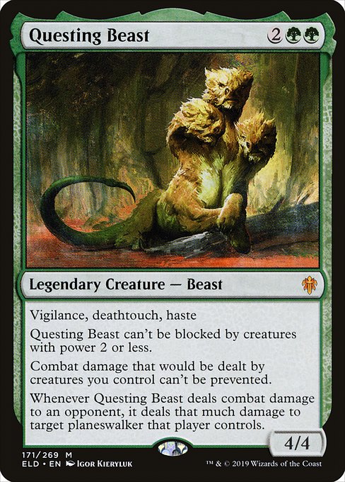


Questing Beast can't be blocked by creatures with power 2 or less.
Combat damage that would be dealt by creatures you control can't be prevented.
Whenever Questing Beast deals combat damage to an opponent, it deals that much damage to target planeswalker that player controls.
If Questing Beast is readable, your average Commander card is going to be fine.
What to do if something fails
Keep this simple. You want a clean diagnosis, not a ten-step ritual.
- Isolate the issue: one card, a subset, or the whole deck.
- Photograph it: one close-up of the problem area, one full-card shot, one comparison next to a “normal” card from the same deck.
- Stop shuffling the problem cards until you’ve talked to the seller. Rough edges and sticky finishes can get worse fast.
FAQs
Should I sleeve proxy decks?
Yes, for two reasons: shuffle feel and consistency. Sleeves smooth out minor finish differences and help prevent accidental “marked card” issues.
How off-center is too off-center?
If it’s only noticeable when you stare, it’s usually fine. If it cuts into the frame, crowds text, or looks obvious from table distance, it’s a problem.
My deck has slight color variation. Is that bad?
Not necessarily. Variation is common, especially across different art sources or print runs. It becomes a problem when it hurts readability or looks wildly inconsistent within the same deck.
My cards are a little curled. Should I worry?
Mild curl is often normal and usually disappears in a sleeve and a deck box. Severe curl, the “potato chip” effect, is a problem because it can create marked cards.
What’s the biggest red flag for gameplay?
Anything that makes a card identifiable in the deck by touch or shine. If you can spot it face-down, it fails the spirit of smooth casual play.